Could Michael Steele have done better?
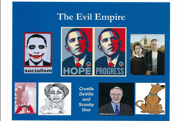
I guess I need to get around to saying something about the slide presentation from the Republican Party to their Donors base detailing election strategy for this coming election season. The slide that’s receiving the most attention.:

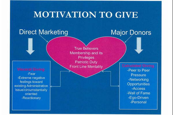
Following as it does the slide this, which in a slide presentation entitled “Putting the FUN Back iN FUNDRAISING” I guess explains the fun that is the pitch to the party rank and file.:
Evidentally Michael Steele went to google images and looked through google images for cartoon cariactures used by Internet bloggers for Reid, Pelosi, and Obama. I wish I could say that Michael Steele could have done better, but looking through the images, I don’t know that he could have.
I’m partial to this image, but it appears to be a rather bi-partisan exercise in humor. And there isn’t anything good that pops up for Nancy Pelosi right off the top — it’s all pretty dreary.
