Measuring the Tom Foley Effect
I’ve noticed on more than one occasion someone trying to make a reference to Mark Foley instead mis-naming Mark to Tom — thus referencing Tom Foley, former Speaker of the House and Congressman of Washington State’s 5th Congressional District — the Spokane area and areas around the Spokane area. Notably defeated in 1994 — the year of the “Republican Revolution”, only the second Speaker of the House to be defeated in an election.
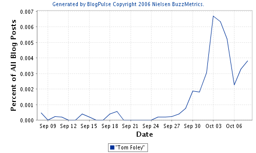
He is not Mark Foley. But I’m curious to see a graph that shows this “Tom Foley Effect”. Here it is, courtesy blogpulse:

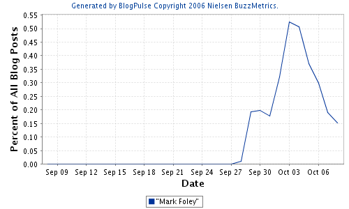
Just for reference, Mark Foley in the same time – period:

For the life of me, I don’t know why the two graphs don’t directly correlate. Why does Tom Foley spike upward at the end there these past two days, while Mark Foley doesn’t? I suppose I could read the blogosphere and see what people are saying about Tom Foley, and see if somehow he’s being referenced sans mistaking him for Mark Foley. Otherwise, explanations are welcome.